sales@entitysport.com
  +91 6377026492
The importance of data in the sports world is not hidden from us. We all know, it has a powerful impact on transforming the sports world. From making data-driven decisions to enhancing fans’ viewing experience, data has all the power. Data has been more than just numbers for sports organizations, players, analysts, and enthusiasts. They use it in different ways, and data visualization is one of the ways for them to get deeper insight from the match, event, or tournament. In this article, we will discuss what are the best design practices for sports data visualization,
Data visualization is used by them to simplify the complex data, as it helps one to understand the hidden insights from the game, as it is in the form of graphs, charts, maps, etc. All these patterns and colors make it easier for the user to understand the complex data and numbers.
In data visualization, numbers are designed in a way that will make it simple and easy to understand for the users. A wide range of people can even understand it, if the data is designed well. Sports platforms and organizations have to share a lot of information with their audience but a simple audience might not understand very complex data that easily. Here, data visualization can be used by them to make the data understandable.
What is sports data visualization?
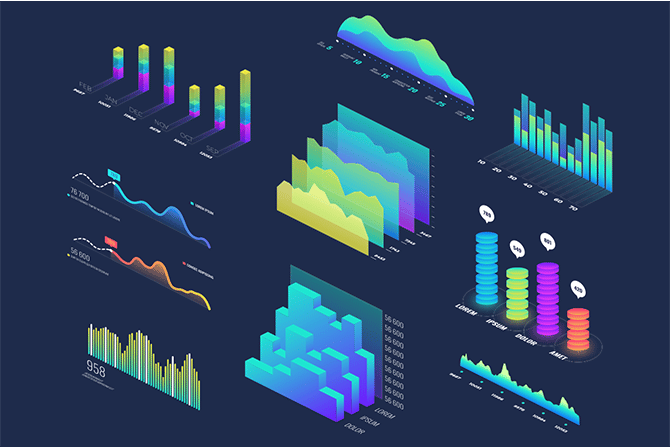
Data visualization is the process of making data visually appealing and understandable to people. For that, one can use elements like charts, graphs, and maps. These elements make it easier for users to understand the complex data. They can also include bar charts, line graphs, pie charts, scatter plots, heat maps, choropleth maps, and more. It is mostly used by sports organizations, fans, trainers, and players.
Data visualization helps them to identify the hidden accept from any match. It helps users quickly identify trends and patterns and also allows them to easily understand the game in the best way possible. The data analyzed by the data visualization method can be used to make major decisions in sports. Data visualization also helps sports organizations enhance their fan engagement by improving their viewing experience.
Why are best practices important in sports data visualization?
Simplify complex data
Best design practices for sports data visualization help users to make complex content simple and easy to understand. One can use visual elements to show data. It can be a chart, graph, or map. It helps to make the data more easy and visually appealing so that one can easily analayse the data. Also, data visualization helps users avoid any kind of confusion and misunderstanding to make sure they can do perfect analysis.
To simplify the data one needs to choose perfect elements, colour schemes, and descriptive levels, to represent the data they want. It helps users do sports trends analysis, make players performance comparisons, and much more.
Deep insights from the game
Sports organizations, trainers and players can data visualization to gain deeper insights from the match. With the help of data, they can predict the outcome of any game, compare players’ and team stats or performance, track field activities, and more. For example, they can get deeper insights into players’ stats like points scored, assists, rebounds, goals, tackles, etc.
They get to know team advanced stats like Win/loss ratios, average points per game, and defensive and offensive efficiency. They can also know game metrics including possession percentages, shooting accuracy, and passing accuracy. Users can analyze all these data to know players’ strengths and weaknesses, opposite team strategies, and more.
Well informed decision-making
Data visualization allows users to make decisions after analyzing the facts. Users like sports team trainers can get in-depth sports data and can analyze it through data visualization methods to make sure they get clear information. The information can be in the format of heat maps, bar graphs, and charts. These elements make it easy for them to analyze data, and advanced stats like player performance, team performance, and more. All this analysis will help them make better decisions for the team and players.
Improves user’s experience
The data visualization technique of analyzing data also helps sports organizations like fantasy apps, betting platforms, fan websites, and others to improve the experience of their users. They can display sports data using elements like bar graphs, pie charts, line graphs, and more on their respective platforms. They can share scores, players’ performance data, team performance data, team analysis, play-by-play game analysis, injury and health updates, etc.
The visualization method for sharing data is most likely to engage more fans to your platform, as they will get to experience simple content. Data visualization makes it easier for them to understand even very complex statistics. You can also provide them with other interactive features like predictive analysis, timeline visualization, and more to enhance their experience.
What are the best design practices for sports data visualization?
Here are the best design practices for sports data visualization;
Understand the Audience
To represent data through data visualization, it is important to understand your audience. You have to identify who are the majority of people who look for your content and spend time on your platform. They can be trainers, fans, players, or others. Once you know who your audience is, you have to make visual data for them and you can also add details according to their preference.
Have a clear purpose
Now, any business requires to have a clear objective about what they aim to represent from their platform. Identifying your audience’s needs will also help you figure out your platform’s purpose and objective.
Fetch data from trustworthy source
To represent data through visualization, you need data first. To collect data you can use any tool like sports API, as it is the easiest way to fetch a wealth of sports data from multiple sports. It is not advised to collect data manually from here and there. Instead, you can contact a trustworthy data partner who can offer APIs for sports like Cricket, Football, Basketball, Hockey and others.
You can select Entity Sports as your data partner, as they offer different well-built APIs. It includes Cricket API, Football API, Hockey API, and more. They are dedicated to offering live scores, Player Performance Data, Game, and Match Data, Comparative Analysis, Historical Data, team performance analysis, and more.
Decide visualization type
Now, it is time for you to decide what type of visualization you want to represent data. It can be trend chat, scatter plot, line charts, bar charts, multiple bar graphs, heat Maps, tree charts, pie charts, and more. You can use these elements to provide various types of sports data like performance trends, players’ records, comparing teams, players, and more.
Keep things simple
One of the most important things that you have to take care of, is to make sure that what you deliver should be simple and easy to understand. The only purpose of data visualization is to make complex data easily understandable. If your visual representation is overloaded with too much information and cluster, nobody is going to read it. Make sure, it is cluster-free and doesn’t overload with a lot of information.
What are some examples of data visualization practices?
Game analysis board
Sports organizations can display game analysis by visualization methods at their platform. They can show line charts to highlight key moments from the match like goals, fouls, sixes, fours, etc. They can also add bar graphs to display individual players’ performance stats. It includes points scored, assists, defensive actions, and much more. Users can also show a timeline of events.
All this game analysis can be used by trainers, players, analysts, and fans too. For example, fans can get a clear understanding of the game. Trainers can use this data to make important decisions about players’ game improvement and sports platforms will be able to enhance the overall viewing experience of their platform.
Live game visualization
Data visualization is use to provide a live game visualization experience to fans. It is not only beneficial for fans but it is used by trainers, analysts, players, and others. Live game visualization means one can obtain the latest insights from ongoing matches. It can be a real-time scoreboard, live line chart heat map, player performance dashboard and much more.
Performance comparison dashboard
You can make bar graphs and group bar graphs to represent the performance comparison of players and teams from sporting events. In player comparison, you can display no of goals scored by all the players from any match. One can also compare players’ performance matrices by displaying their scores, points, assists, or rebounds. In the same way, team performance matrices can be compared by showing metrics such as total goals, assists, and tackles between different teams with bar graphs.
What types of visualizations are commonly used in sports data?

There are various types of visualization used to represent sports data. It includes line charts, heat maps, bar graphs, box plots, pie charts, scatter plots, area charts, and more. Let us discuss about some of them
Line Charts- One can use a line charts to represent trends over time such as performance metrics, scores, or win/loss records from multiple matches and seasons.
Heat Map- You can use heat maps to represent different moments from matches. For Example, you can represent player movement patterns from a match through visualization.
Bar graphs – Users can use bar graphs to compare different sports data. Users can display the comparison of team players’ matrices, players’ performance matrices, player statistics, and game outcomes.
Pie charts– You can use pie charts used to display the player percentage of total points scored by each player on the match. You can also represent data of team composition and game statistics with the help of a pie chart.