sales@entitysport.com
  +91 6377026492
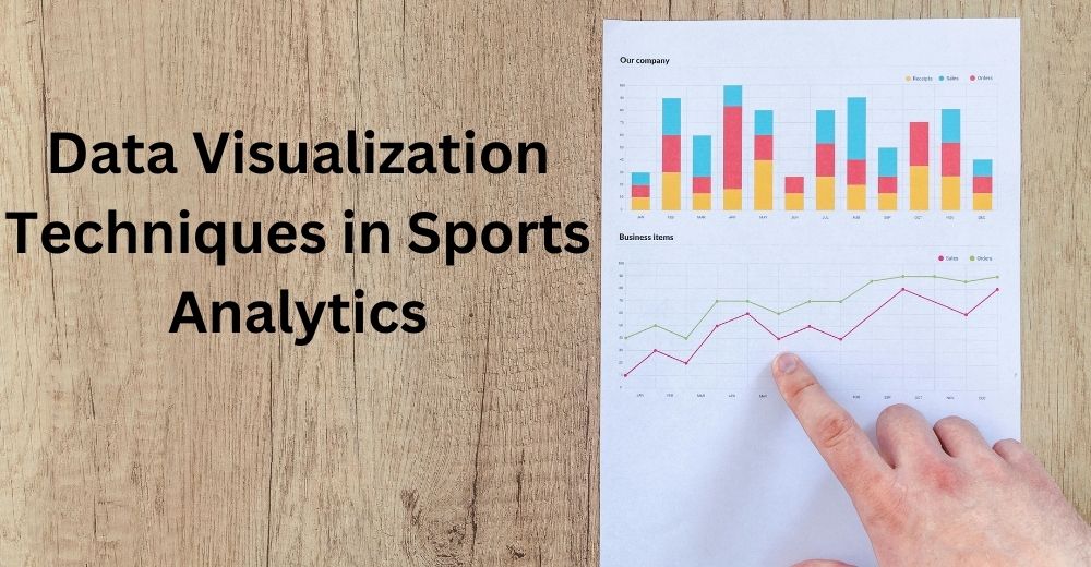
Sports is not only about players and games. Multiple things are working behind the pitch to make the game even more interesting. There are management, trainers, and technology working to analyze the past, make strategies to win the game, and figure out ways that will make the game easier for players and fun for fans. To analyze hidden factors about the game, often sports management uses data visualization techniques.
The team and trainers use numbers and stats to study multiple factors of the game such as players’ performance, game strategies, and more. They use colorful charts and graphs to visualize data that helps to make important decisions about the game. Data visualization leads players and teams one step closer to the trophy. In this article, we will inform you about the techniques of data visualization that are used in sports.
What is Data Visualization?
Data visualization is a powerful tool that is used in other fields as well which include business, science, technology, and education. It represents data and numbers in various formats like charts, graphs, maps, and diagrams to understand hidden insights and patterns.
The graphical representation and visual elements make it easier to understand the hidden facts. The following graphs of data and numbers enable management to make fair decisions, enhance communication, and allow them to understand complex things quickly. This tool enables trainers to make data-driven decisions, ensuring it is human error-free.
What are the key features of Data Visualization?
Data visualization is used in sports for multiple reasons, as it is capable of making complex things easy and understandable with data and numbers. Here are some of the key features of data visualization.
Easy analysis
Data visualizations help users comprehend difficult information easily. It presents information in a clear and precise manner which enables users to understand facts and to get deeper insights. It only presents the important aspect of data that is relevant to users’ demands and avoids any kind of complexity.
Informed decision making
Data visualization provides simple and important information that enables users to make correct decisions after analyzing the patterns, formats, and deeper insights of the collected information. Its data-driven analysis ensures that the collected data is accurate and reliable. It allows decision-makers to make decisions based on correct information without any mistakes.
Comprehensive information
Data visualization is capable of explaining to users all the details of the collected information. For example, from where the information is collected and how one can analyze it. It is capable of providing them with a detailed history of the information through visuals so that it will be easy for the user to understand things in detail.
Why use data visualization for sports data?
Data visualization has proven to be a powerful tool that is used in sports analytics for multiple reasons. From empowering players to enhancing the viewing experience for fans, data visualization plays a huge role in sports analytics. Here is why data visualization is used for sports data:
- Data visualization helps coaches and analytics to track moments during the match in real-time. It helps them to make a well-informed decision, as data visualization allows them to get real-time insights during the match.
- Data visualizations help players monitor their performance and progress. It also helps them to analyze their weak areas, allowing them to enhance their strength by working on the area that needs improvement.
- It helps coaches and players find hidden insights into the game very easily. It helps them to access information easily through charts and graphs, without making it complex.
What are the data visualization techniques used in sports analytics?
Data visualization is a powerful tool used in sports to analyze multiple hidden insights and patterns. Data visualization is used in sports to study players’ performance, it is used to analyze their strengths and weaknesses, and also to figure out if any changes took place in players over time.
There are certain techniques used to analyze this information through data visualization tools. The technique includes line charts, bar graphs, pie charts, donut charts, and more. Let us discuss all these techniques in detail:
Line Charts
The line charts are used to explain the changes that took place over time. In sports, it is used by the players and coaches to present player performances in the line chart format. It is used to show players’ overall performance. For example, it will show a player’s current step count, past step count, and whether it has increased or decreased in the form of a line chart.
Bar Graphs
Bar graphs are used to compare different things. In sports, it is used to compare data of different players or teams so that it will be easier for the management to analyze their performance. For example, in cricket matches it is used to represent the number of wickets taken by a bowler. Various types of bar graphs are there such as Horizontal bar graphs, Vertical bar graphs, Double bar graphs, Multiple bar graphs, Stacked bar graphs, and Bar line graphs.
Pie Charts
Pie charts represent data in the form of circular graphs. It is used to present different categories of data that are divided into slices.
Donut chat
Donut charts represent information in a circular graph that looks like a donut. A donut chart makes it easier to read and understand the data.
Scatter Plots
The scatter plot is used in sports to explain the relationship between two variables. Three main types of scatter plot are used, Positive correlation scatterplot (to show a positive linear function), Negative association scatterplot (to show a negative linear function), and no Correlation scatter plot.
Heat Maps
A heat map represents data in graphics form by using different colors. These analytics tools allow players and coaches to track players’ movements during the match. Heat maps enable fans to easily track the location of players while playing on the field.
Dashboard
The dashboard is used in sports to show scorecards, past analytics player cards, trending viewer comments, and more. The dashboard is used by makers to make the correct decision. The three types of dashboards are Operational dashboards, Strategic dashboards, and Analytical dashboards.
Motion Charts
A motion chart is used to track the movements of players and the total time spent by them in that movement during the game. It is used to capture systems, wearable sensors, and other technologies. It helps to enhance players’ performance in multiple ways, it helps to improve the training of players, improve strategies and game plans, reduce injury risk, and much more.
Widgets
Widgets are used to show the live scores and other types of stats in more interactive way. If you want to see the records of the players and teams, match, competitions, you can see them in much more interactive way. By seeing the widgets, you can analysis the sports data easily. If you show the sports data in the form of the widgets on your website or app, you can enhance the engagement of that app and website. You can ensure that users stick to you longer than expected. This is the power of the widgets. This is the reason when we talk about the Data Visualization, we can not afford to ignore the role of widget in it. There are many platforms out there in the world that provide users with the pre-built widgets that you can integrate onto your app and website easily. You can use widget of any sports. However, not every platform provides you with the widgets of all sports. However, you can get the interactive sports widget from Entity sports too as it provides you with the widgets of all sports with a lot of interactive element in them.
What is the process of Data Visualization?
There are certain steps followed to create and analyze information through data visualization. Here are the key steps involved in the process of data visualization:
Goal setting
It is important to decide what type of data you want for your platform. you also need to figure out what kind of audience you are going to serve and what kind of data and features your audience expects from you.
Acquiring the data
The second step is to collect the data from different sources and make sure that the data you are getting is from a trustworthy data partner so that you get accurate and reliable data. If you are searching for a trustworthy sports data provider, you can partner with Entity’s sports API to acquire accurate data.
Clean and filer data
Once you have the data you want for your business. You need to clean it and remove the unwanted and irrelevant data.
Select a visualization technique
Now, you can select the visualization technique you want to use that suits your data type. You need to make sure that whatever study you have done should be easily conveyed through your chosen technique of data visualization.
Design and create your visualization
Now, you can design your visualization by adding colors, layouts, and so on. You can use data visualization tools to represent your data and information. You can choose charts, graphs, and plots whichever suits the best to convey the data.
Review
Review the visual of your data so that you can improve and adjust if anything needs improvement and adjustment.
Analysis
Once done reviewing, your data is ready for analysis. Now, you can use this to identify hidden patterns, trends, and insights.
What Different Sports Use Analytics?
Football
In Football, data analytics is used for various purposes which include, monitoring players’ fitness, identifying opponents’ game plans, and tracking other data. Analytics is used by the trainer to get information about players’ performance such as, the goal scored by them, and their defending strategies so that the trainer can improve the area that needs improvement.
Cricket
Data Analytics plays a crucial role in analyzing players’ performance, opponents’ strategies, and so on in cricket matches. It is used to analyze every aspect of the game which includes batting, bowling, fielding, and much more. Data analytics allows coaches to monitor players’ strengths and weaknesses so that they can enhance their performance.
Basketball
Data analytics also plays a vital role in basketball as well. It helps to analyze players’ performance, team dynamics, team performance, and much more. It helps teams to make informed decisions as it is capable of providing information based on statistical data. It helps analyze statistics like point scores, shooting percentage, individual players’ performance matrix, and whatnot.
In conclusion, at Entity, we are committed to helping various sports organizations like websites, mobile apps, and publishers to get accurate and reliable data from the sports world. We provide you with data through different sports APIs. Our sports API includes Cricket API, Football API, Basketball API, and much more. You can read this blog to understand how data from Entity Sports API can be used for sports analytics.
Read more:
Exploring the latest trends in Sports Technology
The Role of Artificial Intelligence In Transforming Sports Broadcasting